DS Styleguide
Creating a design system from scratch is hard! And it’s really tough to make changes once people start consuming a design system, because by its nature it’s meant to proliferate quickly (and becomes deeply-embedded quickly).
The following are rough tips and tricks to organizing and naming design tokens that work well for most setups, compiled partially from experience and partially from borrowing the best of other public design systems.
Color
Color tokens make up not only the largest volume of most design tokens; they also tend to be the most complex systems (and the largest source of accessibility errors through failing contrast). Thus, getting color right is the biggest payoff for any system. Here are some general tips to
No component tokens
An emerging pattern in design token naming is layering Primitive → Semantic → Component tokens (example).
| Layer | Description |
|---|---|
| Primitive | The lowest layer. Descriptive. Consists of raw values (e.g. color.gray.200). |
| Semantic | 2nd layer. Consists of Meaning and usage (e.g. color.success). |
| Component | 3rd layer. Maps tokens from previous layers to component properties (e.g. button.bg-color). |
All layers will use modes. And for that reason, every additional layer of tokens exponentially increases the possible number of tokens you’ll have to manage. But by the time you’ve reached the component layer, you’ve already reached an order of magnitude that is unsustainable for most teams (Atlassian quoted their number of tokens at 37,000 due to component tokens [source from Config 2024; talk upload pending]!). And for that reason, limiting your tokens to 2 layers: primitive and semantic will yield dividends in saved time and complexity.
TL;DR don’t use component tokens. Instead, try and find common threads of intent to drastically deduplicate the number of tokens you’ll have to manage.
Don’t invert colors in primitive layer
A common pitfall of building color ramps is trying to handle light and dark mode at the lowest layer by inverting it there. Take for example Radix colors:
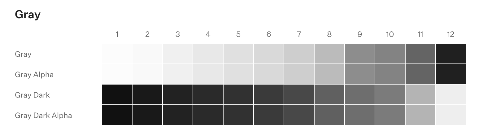
Most flawed dark mode approaches start with an innocent pitch: “let’s just invert the color ramp and see how far we get!.” The answer is: not very far. Every design system needs to invert at the semantic layer.
Example
For an example, let’s work out colors for “elevated” components: Dialogs, Tooltips, Dialogs, etc. Starting from basic color theory—cool/dark colors recede; warm/light colors come forward—we want elevated UI to be lighter than the background (either flatly, with a dropshadow, or both). So we map color.bg to the darkest gray, and the elevated components are 1 step lighter:
| Component Property | Dark Mode |
|---|---|
| Main background | color.gray.100 (darkest) |
| Elevated background | color.gray.200 (1 step lighter) |
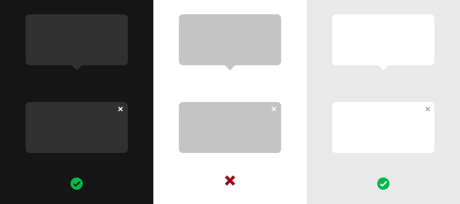
So far so good, but we have a problem when we go to light mode. If we simply invert the colors, we end up with elevated UI being darker than the background (middle illustration), which is not what we want. It seems like it’s disabled!
| Component Property | Dark Mode | Light Mode |
|---|---|---|
| Main background | color.gray.100 | color.gray.100 |
| Elevated background | color.gray.200 | ❌ color.gray.200 (too dark) |
And so to fix it, we end up with this awkward remapping here:
| Component Property | Dark Mode | Light Mode |
|---|---|---|
| Main background | color.gray.100 | color.gray.200 |
| Elevated background | color.gray.200 | ✅ color.gray.100 |
Already our plan to invert the primitive token ramp backfired: we already had to decouple the colors at the semantic layer for elevated UI. So it begs the question: if the colors have to be remapped at the semantic layer anyway, does inverting the scale just add to confusion? For most systems, the answer is “yes”—inverting just adds unnecessary confusion. Compare:
| Universal direction | Inverted direction |
|---|---|
100 is always “lightest” value | 100 is… hang on… let me think… |
Whether 100 is “lightest” or “darkest” doesn’t matter (or whatever number system you use, for that matter). The choice is yours. The only callout here is to make it consistent across all modes so working across modes is easier.
TL;DR — always ramping your colors in a universal direction for both light and dark mode saves unnecessary headaches.